
Article summary
Popular and timeless fence colours that complement Kiwi homes and landscapes.
- Category:
- design
- Read time:
- 8 min
- Published:
- 31 March 2025
- Written by:
- My Homes Fencing Expert
Quick answer: the most popular fence colours in NZ right now are dark charcoal and black, which recede visually, make gardens pop and look modern, followed by natural timber stains and soft neutral greys and greens that blend into the landscape. As a rule, darker fences make a yard feel bigger and more designed, while lighter tones feel more traditional. Match the fence to your house and let planting stand out against it.
Fence colour changes the whole feel of a yard, so it's worth choosing deliberately. Here are the colours working best on Kiwi homes.
Dark Tones: Why They Work So Well
Charcoal and black have become the default for modern New Zealand fences, and the reason is a genuine visual effect rather than fashion alone. A dark fence recedes. The eye stops reading it as a boundary and starts reading it as depth, which makes the yard feel larger than the same space enclosed in a pale fence that advances toward you.
The second effect is contrast. Green foliage against charcoal is one of the most reliable combinations in garden design — the planting reads as vivid and sculptural in a way it simply does not against a mid-brown or cream fence. If you have spent money on landscaping, a dark fence is what makes it visible.
Deep greys are the softer version of the same idea and are often the better choice on a house with warm tones, where true black can feel severe. Both suit the slat and mixed-material styles currently popular, because the dark colour lets the geometry of the fence do the work.
The Heat Trade-off Nobody Mentions
Here is the honest caveat on dark fences, and it applies with particular force in New Zealand's UV. A black timber fence in full afternoon sun gets genuinely hot — far hotter than the air temperature — and that heat does two things.
First, it drives moisture movement in the timber. The sun-facing side dries hard and fast while the shaded side stays damp, and that differential is what makes boards cup, twist and open up gaps. A dark fence on a hot north- or west-facing boundary works its timber considerably harder than a pale one in the same position.
Second, heat and UV together are what break down coatings, so the sunniest runs of a dark fence will need attention sooner than the shaded ones. None of this makes dark a bad choice — it remains the best-looking option for most modern homes — but it does mean quality timber, a quality coating and realistic expectations about re-coating the sunny elevations.
Stain or Paint? A Bigger Decision Than Colour
This matters more than which colour you pick, and it is where most fence-finishing regret comes from. Stain penetrates into the timber and colours it. Paint sits on the surface as a film. They fail in completely different ways, and one of those ways is much more expensive.
A stained fence fades. As the colour weakens you clean the fence and apply another coat straight over the top, and the job is essentially a wash and a re-coat. There is nothing to strip and nothing to prepare beyond cleaning, which is why stained fences stay easy to maintain for their whole life.
A painted fence peels. Moisture works in behind the film — through end grain, through the back face, through any nick — and lifts it, and once that starts you are into scraping, sanding and priming before you can recoat. On a long boundary that is a serious job, and it recurs. For rough-sawn timber fencing, stain is usually the right answer; paint suits smooth, well-detailed feature fences where the finish quality justifies the upkeep.
Naturals: Working With the Grain
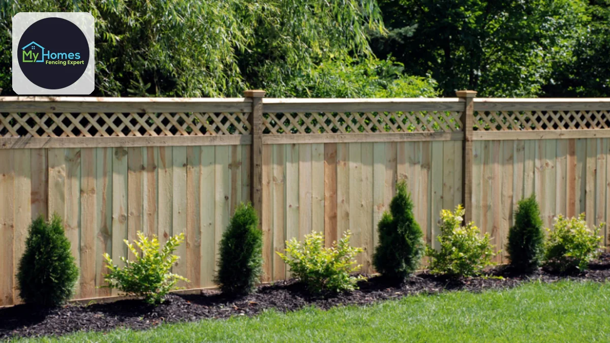
Natural timber stains remain timeless, and they do something the solid colours cannot — they let the grain show. On a character villa or bungalow, a mid to warm brown that reveals the timber underneath sits far more comfortably than a flat opaque colour, because the material reads as what it is.
The practical advantage is forgiveness. A semi-transparent natural stain fades gradually and evenly rather than showing a hard line between old and new coats, so re-coating is undemanding and patch repairs blend in. If you replace a paling in five years, it will disappear into a natural-stained fence far more readily than into a solid black one.
The trade-off is that natural stains offer less UV protection to the timber than heavily pigmented ones — pigment is what blocks UV. Very light or clear finishes look beautiful for a season or two and then need attention. A mid-tone natural is the sweet spot for New Zealand conditions.
Greens and Making a Fence Disappear
Muted greens — sage, olive, deep forest — are the specialist's choice, and they do something distinctive: they let the fence vanish into the planting. Where charcoal makes a garden pop by contrast, a deep green makes the boundary itself hard to locate, which visually pushes the edge of your section further away.
This works best on a boundary with established planting in front of it and on properties where the outlook is bush or heavy greenery. On a bare boundary with nothing in front, green can read as an odd choice rather than a considered one — it needs the planting to make sense.
Soft neutral greys and taupes are the safe middle ground. They complement almost any house colour without competing, they age gracefully as trends move, and they neither dominate a garden nor disappear into it. If you are fencing to sell, or simply do not want to think about it again, this is the low-risk family.
Relating the Fence to the House
The principle that prevents most bad outcomes is simple: choose the fence colour in relation to the house, roof and joinery, not in isolation. A fence that echoes an existing element — the roof, the window frames, the garage door, the guttering — reads as part of the property. A fence chosen purely on its own merits often reads as a separate object parked along the boundary.
Picking up the roof colour is the most reliable move, particularly with coated steel fencing where fence and roof colour ranges overlap directly. Joinery is the next best anchor, especially on modern homes where the window frames are already dark.
Consistency across the frontage matters as much as the colour itself. Fence, gate, letterbox surround, carport screen and any freestanding screens all in one tone will look deliberate even in an ordinary colour. Three near-misses of the same colour will look accidental no matter how good each one is.
Test It in Your Own Light
Colour chips lie, and they lie in a specific direction: a colour almost always reads darker and more saturated over a large area than it does on a small sample. Charcoal that looks like a soft mid-grey on a chart can read close to black across twenty metres of boundary.
So test properly. Put a sample on the actual fence, in the actual position, and look at it in morning light, in harsh midday sun and at dusk — Auckland light changes the reading of a colour more than most people expect, and a colour chosen under a hardware store's fluorescents frequently disappoints outdoors.
Look at it wet, too. Rain darkens most finishes noticeably, and you will be seeing that version of your fence for a good part of an Auckland winter. My Homes Fencing Expert can advise on colours that suit your home and hold up in local conditions, and can supply and finish the fence in one job. Call 022 315 8987 or book a free, no-obligation consult.
Frequently Asked Questions
Dark charcoal and black lead comfortably. They recede visually so the yard feels larger, and green planting reads as vivid against them. Natural timber stains and soft neutral greys follow, for a more traditional or lower-risk look.
Stain, for most timber fences. Stain penetrates and fades, so re-coating is a wash and another coat. Paint sits on the surface as a film and eventually peels, which means scraping, sanding and priming before you can recoat. Paint suits smooth feature fences where the finish justifies the work.
They get genuinely hot in full sun, and that drives timber movement — the sun-facing side dries hard while the shaded side stays damp, which causes cupping and gaps. It also breaks coatings down faster on sunny elevations. Dark still looks best; just use good timber, a good coating and expect the sunny runs to need attention first.
Dark makes a yard feel larger and acts as a strong backdrop for planting. Light feels more traditional but tends to advance visually and can wash out against heavy greenery. Relate the choice to your house, roof and joinery rather than deciding the fence in isolation.
Charcoal, black or deep green. Foliage and flowers pop against a dark backdrop in a way they never do against mid-brown or cream. A muted green goes further and lets the boundary almost disappear into the planting — though it needs planting in front of it to make sense.
Because colour reads darker and more saturated over a large area than on a small chip. Test a sample on the actual fence in its actual position, and look at it in morning, midday and evening light — and once it's wet, since rain darkens most finishes considerably.
Less well, because pigment is what blocks UV — the more transparent the finish, the less protection it gives. Very light or clear finishes look lovely for a season or two then need attention. A mid-tone natural stain is the practical sweet spot for New Zealand conditions.
Ready to start your fencing project?
Get a free, no-obligation quote anywhere in Auckland.
Get a Free QuoteRelated fencing services