Article summary
Get inspired with contemporary fencing designs that boost privacy, security, and kerb appeal for modern Kiwi homes.
- Category:
- design
- Read time:
- 8 min
- Published:
- 31 January 2026
- Written by:
- My Homes Fencing Expert
Quick answer: the modern Auckland look right now is clean lines, dark tones and mixed materials — horizontal or vertical slats, dark charcoal and black stains, aluminium feature panels, and fences that tie into the landscaping rather than just marking the boundary. The trick to a contemporary fence is restraint: consistent colour, hidden fixings and simple proportions read as far more designed than fussy detailing.
If you want a fence that lifts your home's frontage rather than just doing a job, here are the design directions we're building most across Auckland — and how to make them work on a real budget.
What Actually Makes a Fence Look Modern
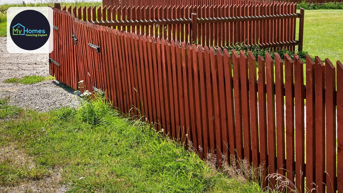
Before the ideas, the principle behind all of them, because it explains why some expensive fences look ordinary and some cheap ones look designed. Modern fencing is not a material or a colour. It is restraint, repetition and alignment.
Restraint means doing fewer things. One material, one colour, one board width, one gap. Every additional decision you introduce — a decorative top, a second colour, a change of profile halfway along — is another thing that has to be justified, and most of them are not.
Repetition and alignment are what the eye actually reads as quality. Even spacing, a consistent line, and edges that align with each other register as deliberate at a glance, even from a passing car. This is genuinely good news for a budget: precision costs labour, not materials, and careful execution in treated pine will outperform careless execution in anything.
Ideas 1 and 2: Slat Direction and Spacing
**Idea one — horizontal slats to widen.** Long horizontal lines pull the eye sideways and make a frontage read as wider and lower, which flatters most single-storey homes and makes a narrow section feel less pinched. It is the signature contemporary look for a reason.
**Idea two — vertical slats to lift, and to last.** Vertical reads as more upright and screen-like, suits taller privacy runs, and has practical advantages horizontal does not: it sheds water rather than collecting it on every upward edge, and it does not sag between posts. On a shaded or wet boundary, vertical is the more durable choice.
With either, the spacing ratio does the design work. Think in proportion — gap width relative to slat width — rather than in millimetres, because the same 20mm gap looks completely different between narrow slats and wide ones. And look at a built fence from normal viewing distance before deciding, since samples on the ground never read the same.
Ideas 3 and 4: Dark Tones and One-Colour Discipline
**Idea three — go dark.** Charcoal and black dominate current Auckland fencing because of a real visual effect: dark surfaces recede, so the boundary reads as depth rather than as a wall, and the yard feels larger. Planting also reads as vivid against dark in a way it never does against mid-brown or cream.
**Idea four — use exactly one colour.** This is the highest-return, lowest-cost idea on the page. Fence, gate, letterbox surround, carport screen, bin enclosure and any freestanding screens all in the same tone will look deliberate even in an entirely ordinary colour. Three near-misses of the same colour will look accidental no matter how good each piece is.
The honest caveat on dark: it gets genuinely hot in full sun, which drives timber movement — the sun-facing side dries hard while the shaded side stays damp, and that differential causes cupping. Use good timber, a good coating, and expect the north and west runs to need attention before the shaded ones.
Ideas 5 and 6: Base Courses and Mixed Materials
**Idea five — a solid base with a lighter top.** A low masonry, rendered or SmartWall base course carrying a slat or light rail above is one of the most effective contemporary moves available. It gives the fence visual weight where it meets the ground, which is exactly where a fence looks flimsy, while keeping the upper portion open.
It also solves a practical problem elegantly: the base keeps timber out of wet soil and off the splash zone, removing the place fences actually rot. A design decision that happens to be a durability decision is worth taking seriously.
**Idea six — mix materials strategically.** An aluminium or dark-stained slat feature at the street with simpler paling down the sides gets you a designer frontage without paying designer rates for thirty metres nobody sees. Match the spend to exposure as well as visibility: low-maintenance material where salt lands or access is hard, cheaper material where you can easily reach it.
Ideas 7 and 8: Fixings and the Capping Line
**Idea seven — hide or align the fixings.** Visible screw heads scattered at slightly different positions are the single most common thing that makes a well-built fence look homemade. Either conceal the fixings within the system, or set them out so they land in a consistent line down every board. Aligned fasteners read as intentional; random ones read as fast.
**Idea eight — commit to a crisp capping line.** The top edge of a fence is its most visible line and the one the eye follows from a distance. A clean capping rail, a consistent shadow gap, or a deliberately exposed slat end all work — what does not work is a top edge that wanders, or capping that changes height at a join.
Both of these are pure execution rather than material, which is why they are the ideas that most reliably lift a modest budget. They also survive fashion, because precision does not date the way a decorative detail does.
Ideas 9 and 10: Integration and Landscape Continuity
**Idea nine — build things into the fence.** A planter box integrated at the base, a bench formed off the framing, a bin enclosure that reads as part of the run, or a recessed letterbox all make the fence part of the property's design rather than an object placed along its edge. These are also the elements that turn dead boundary space into something useful.
**Idea ten — carry the fence into the landscape.** The strongest modern outdoor spaces read as one designed area, which means the fence stain matching the deck and screen stains, the same post cap or board spacing repeated across unconnected structures, and planting positioned with the fence rather than parked in front of it afterwards.
Low-level lighting deserves a mention here too — a few well-placed lights washing a slat fence at night transforms how a frontage presents for very little money, and it doubles as a security measure.
Executing It on a Real Budget
The strategy that works is to spend where it is seen. Put the design budget into the street-facing elevation — the feature panel, the gate, the colour, the lighting — and keep the side and rear boundaries simple and cost-effective. Nobody assesses your property from the rear boundary.
Then remember that most of the ideas above cost labour and decisions rather than materials. One colour, aligned fixings, a consistent capping line, even spacing and a straight run are all free at specification time and expensive to retrofit. Ask for them explicitly rather than assuming they are included.
What looks sharp on a flat urban site is not always what suits a sloping or coastal one, where material choice carries durability consequences as well as design ones. My Homes Fencing Expert will work through the design with you on your actual section and quote it properly. Call 022 315 8987 or book a free, no-obligation consult.
Frequently Asked Questions
Slat fencing in dark charcoal or black, often with a solid low base course under a lighter top, and mixed materials — a feature at the street with simpler fencing elsewhere. But the style matters less than the execution: restraint, repetition and alignment are what read as modern.
Charcoal or black, with deep grey as the softer option. Dark tones recede so the yard feels larger and planting reads vivid against them. Far more important is using exactly one colour across fence, gate, letterbox surround and screens — that's the highest-return decision available.
Horizontal pulls the eye sideways and makes a frontage read wider and lower, which flatters single-storey homes. Vertical reads more upright and is the more durable choice — it sheds water instead of collecting it on every upward edge, and doesn't sag between posts.
Spend where it's seen — the street elevation, the gate, the colour — and keep side boundaries simple. Then note that most design quality is labour and decisions, not materials: one colour, aligned fixings, a crisp capping line and even spacing cost nothing at specification time.
Usually the fixings. Visible screw heads at slightly different positions down each board is the most common giveaway. Either conceal them within the system or set them out to land in a consistent line — aligned fasteners read as intentional, random ones read as rushed.
A low masonry, rendered or SmartWall base carrying slats or a light rail above. It gives visual weight exactly where a fence otherwise looks flimsy, and it keeps timber out of wet soil and the splash zone — a design decision that's also a durability decision.
Heat. Dark timber in full sun gets far hotter than the air, drying the sun-facing side hard while the shaded side stays damp, which causes cupping and gaps. It's still the best-looking option for most modern homes — just use good timber and expect the sunny runs to age first.
Ready to start your fencing project?
Get a free, no-obligation quote anywhere in Auckland.
Get a Free QuoteRelated fencing services